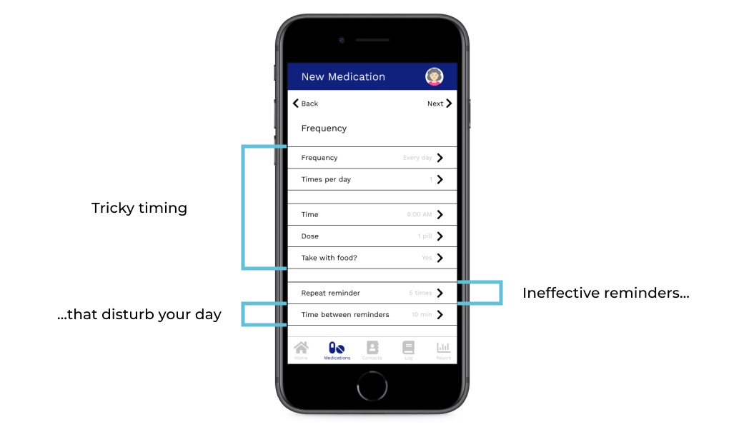
To make the app easy to use, I used the bright blue accent color (or red for destructive actions) to immediately point users to actionable buttons, text, and icons. I also based many of the actions you can do in the app, like editing and messaging contacts, on native mobile phone functionalities to make the whole thing more intuitive. During my usability study, I found that many selected the bottom right ‘+’ button on the “Trackers” page to add a new tracker entry when asked to add a new tracker altogether, so I decided to add a popup menu to give users the option of what they want to add. After developing the responsive website, I’m not sure I still stand by that decision; I needed to add yet another menu for users to select their tracker, which is easily done from the same page, and it isn’t as cohesive as the flow of the same task in the website’s version of the same task.
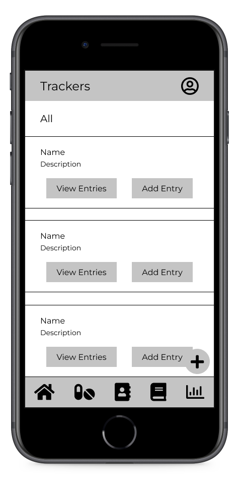
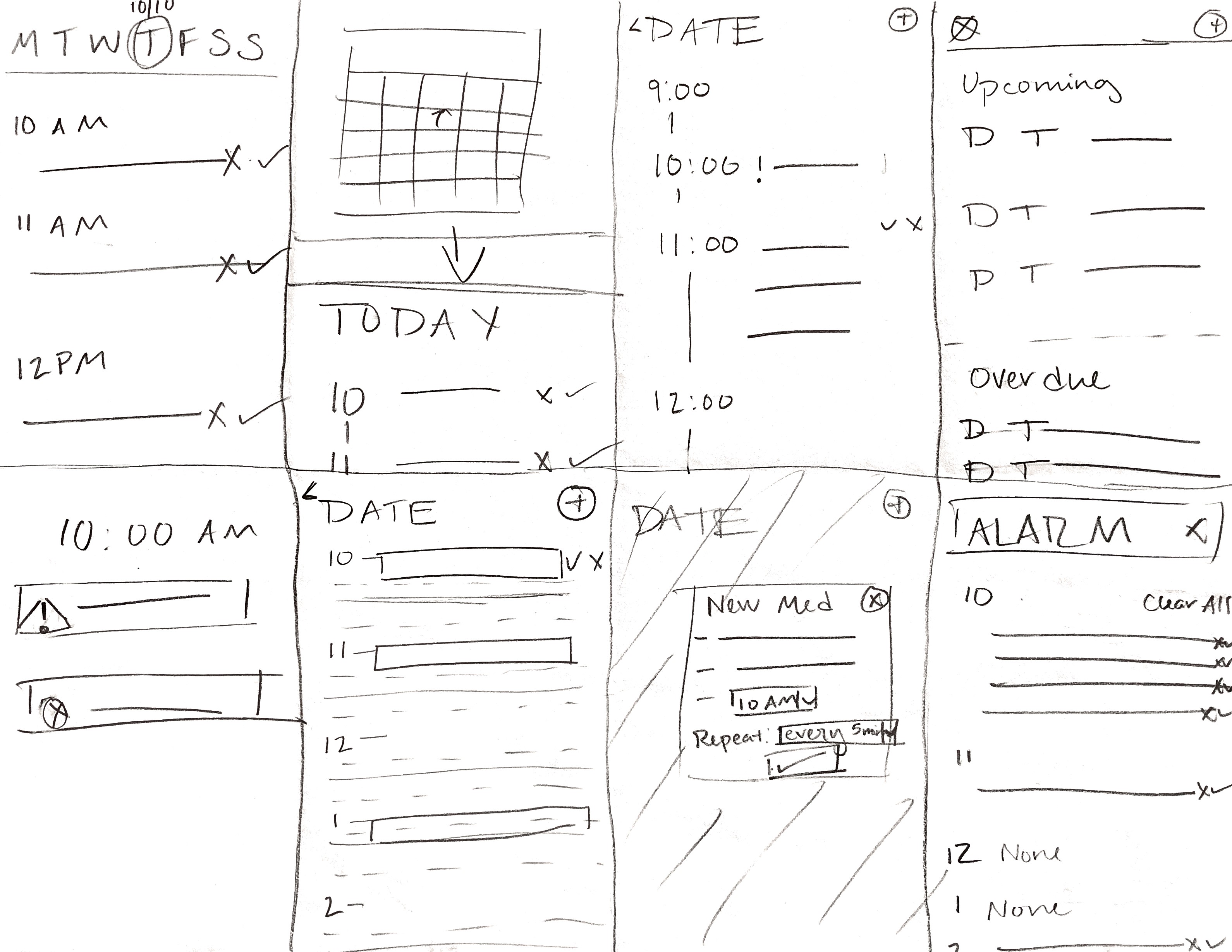
Wireframe of tracker page, with a confusing name, identical grey buttons and an ambiguous ‘+’ button
.png)
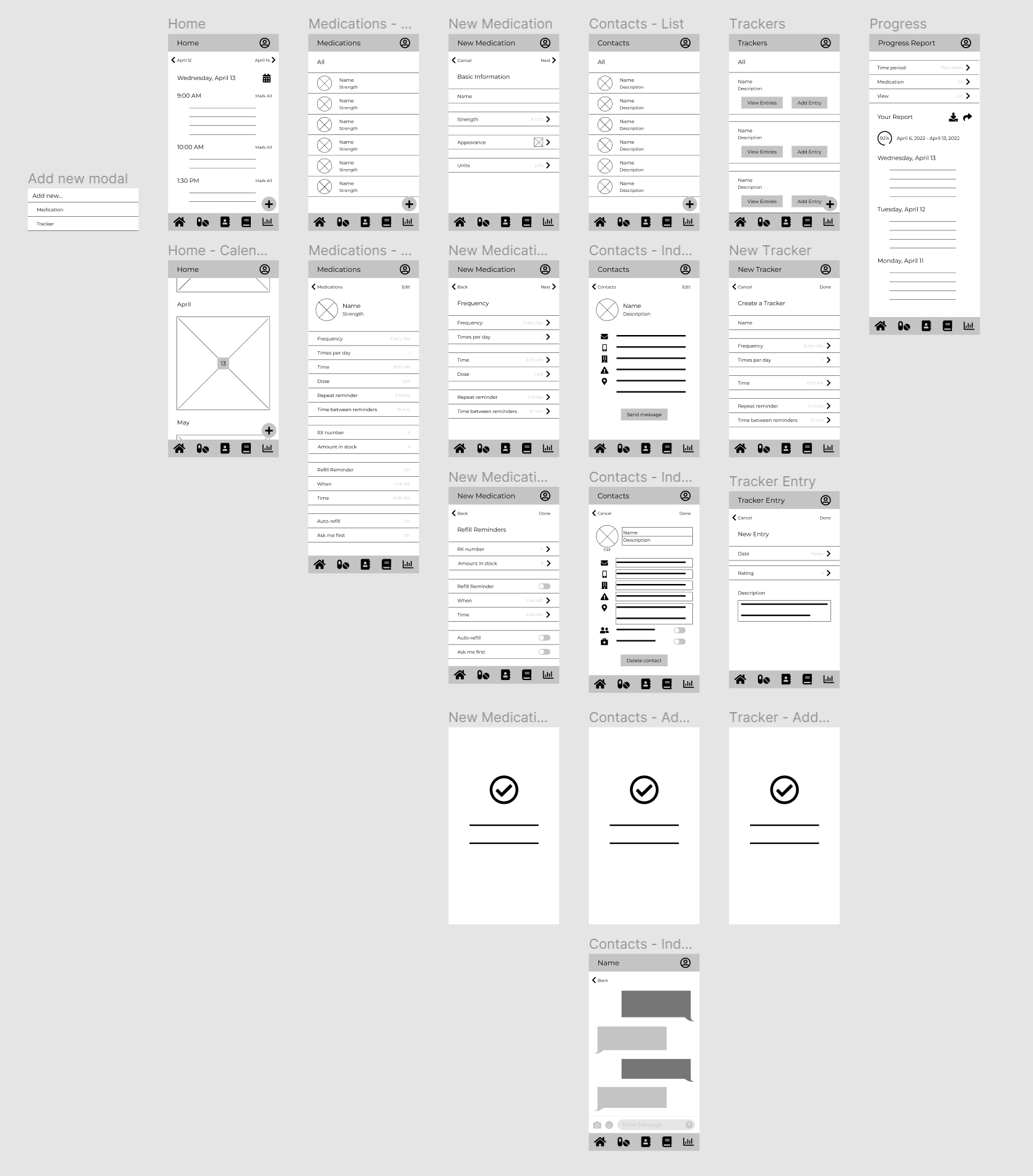
The updated mockup, now titled “My Health Log,” with two blue call-to-action buttons and the new choice to add either a tracker or a tracker entry
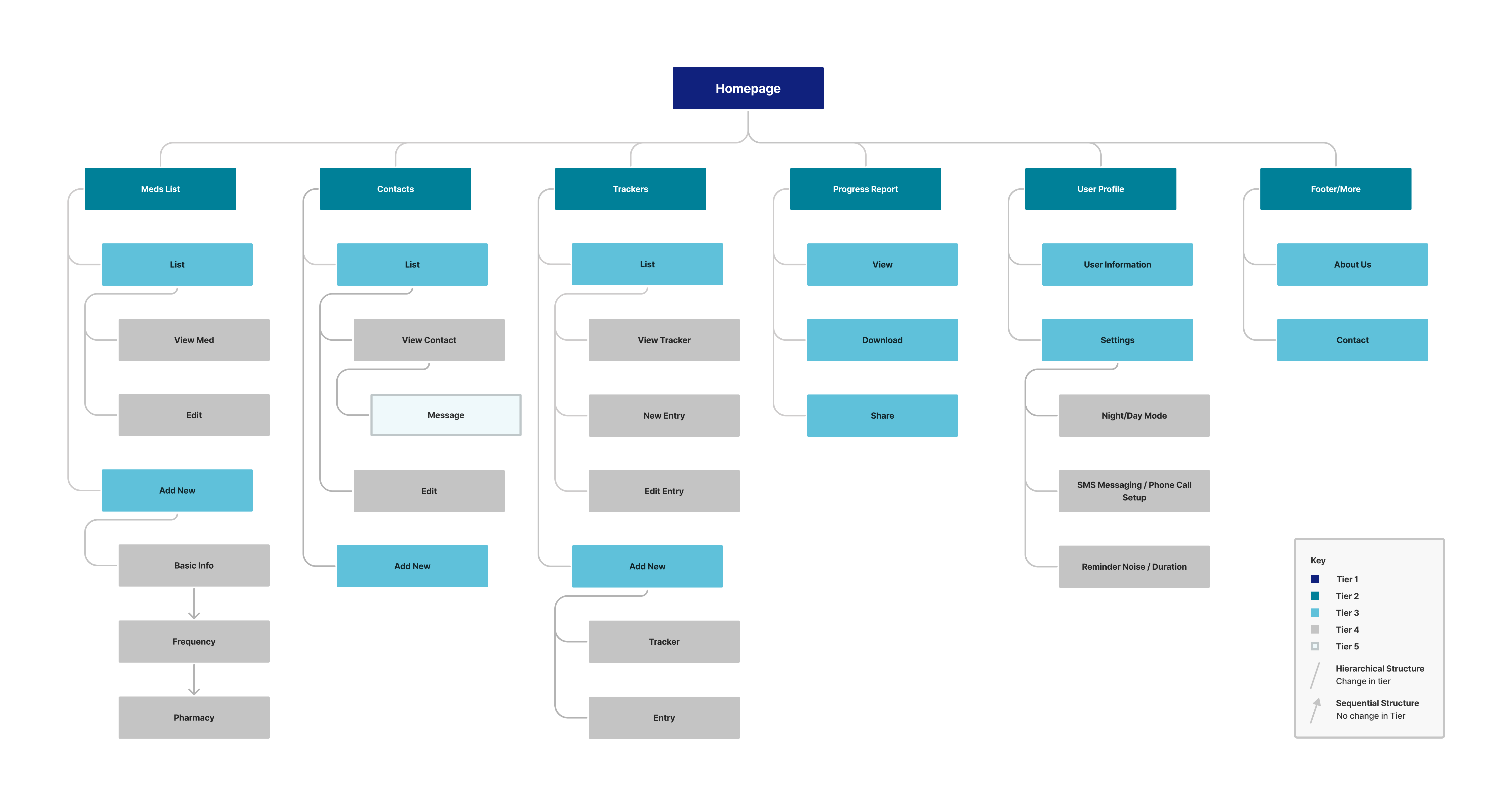
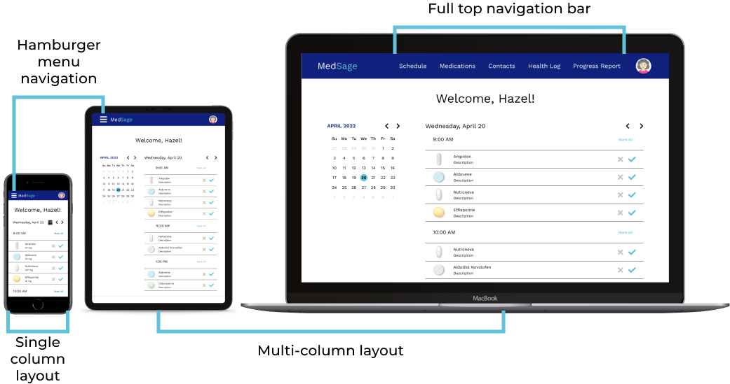
To make the app easier for users to navigate, I added labels to navigation icons so they understand what each one represents. Three of the five main navigation pages have separate user flows within themselves, so I provided back and forward buttons at the top of the page to allow for easy navigation.
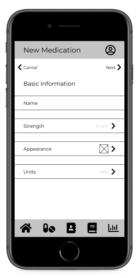
Wireframe of “new medication” page; while the left and right arrows are labeled, the navbar is not
.png)
The updated mockup, with labeled icons in the navbar
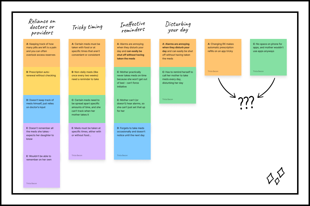
Making the app easy to understand always proves to be more of a challenge than I initially anticipate, particularly with so little text and imagery for users to get context from. Most users understood the purpose of the homepage and medication pages, but a few didn’t understand the purpose of contact and progress report pages, and all of them thought the trackers page was confusing. To combat this, I changed the tracker page’s name to “My Health Log” (as shown above), and I used the mockups as a chance to provide context clues throughout the app using item names and descriptions. There were a few other instances of users getting tripped up by terminology that I changed accordingly, but if I were to continue this project, I would need to run a new usability study on the high-fidelity prototype to a) see if those changes were effective, and b) see if the added content affects the user’s understanding of the app.


