Project background

Affogato is a fictional café chain that I came up with for my Google UX Design Certificate Program.  It is a small local business, with 3 locations in one centralized area, that is trying to expand beyond their current city.  Because Affogato is still fairly small, my job was to design a user-friendly website that adapts to all platforms rather than to design any outside applications.  My main focus on this project was making sure the design translated well on desktop and mobile platforms, both in looks and in ease of navigation.

Challenges

1
Create a website that is just as intuitive and accessible on mobile as it is on desktop.
2
Ensure that the ordering process is smooth and easy for users to understand.
3
Make any hidden or confusing information (i.e. price tags, pickup times, etc.) easily visible to the user.

Initial research

My foundational research included conducting interviews with the target audience, creating empathy maps based off of those findings, creating personas based on those empathy maps, and then creating user journey exercises and storyboards based on those personas.  There was hardly any overlap between interviewee pain points; each person had something different they fixated on, and most of the points had less to do with ordering itself, and more to do with payment and pickup after ordering. As a result, I struggled to define a clear user need for these pain points, and instead chose to address the two complaints most relevant to the checkout process.
I also asked each interviewee if they’d prefer a mobile app or a website, and the response was overwhelmingly in favor of the mobile app.  Just about everyone thought that websites were too glitchy, insecure, and poorly laid out for mobile devices, which seemed to be the preferred platform for ordering on the go.  Therefore, I decided to to focus on making the mobile site just as easy to use as an app to prevent this prejudice from harming the café’s business.
I also completed a competitive audit during this stage to get an idea of what other cafés were doing with their websites and to see if I could spot those user pain points in other websites.  The biggest issue I found with those was poor functionality on mobile devices, but as most of them have separate apps for mobile ordering, it doesn’t pose too big of an issue for them as it would for Affogato.

Pain points

1

Poor usability of websites on mobile devices
Many people prefer to order their coffee on the go, meaning they’d be using their mobile device, but many websites aren’t responsive or have a poor mobile layout.

2

Long wait times
Customers might have to wait a while to get their ordered items, even if they ordered ahead.

3

Pricing confusion
Sometimes prices are hidden until checkout, reward specials are poorly worded, or users must preload money onto an account to checkout.  Any issue that affects the final price of the sale frustrates the user.

Meet the users

Vashti's persona file
Vashti: the early morning grab-and-go customer
Adrianna's persona file
Adrianna: the sit-down-and-study customer

So how will this thing work?

After completing the interviews, storyboards, and user journeys, I had so many ideas that I wasn’t sure how to go about this project.  The first step was to figure out the basic layout of the website, which I did with this sitemap.  It helped me organize my thoughts and structure the content in a reasonable way.
Sitemap diagram detailing all website pages
Now that I knew what needed to be included for a completely functioning product, I was able to prioritize what to design for the sake of a portfolio project.  I chose to focus the most attention on the “Menu” and “Cart” pages, but I did still create the “Scan” page and a footer for the site.

Wireframing

After completing the interviews, storyboards, and user journeys, I had so many ideas that I wasn’t sure how to go about this project.  The first step was to figure out the basic layout of the website, which I did with this sitemap.  It helped me organize my thoughts and structure the content in a reasonable way.
Paper wireframes for desktop version of site
Paper wireframes of the desktop version of the website. These depict the 5 unique page designs in the main user flow.
Digital wireframes of the same pages for various screen sizes
Digital wireframes of every paper wireframe I made.  For this project, the tablet wireframes ended up being optional content, so I chose to prioritize the desktop and mobile platforms moving forward.

Low-fidelity prototype

The lo-fi prototypes were developed in Adobe XD.  The main user flow is to order a hot tea from Affogato.  There is also a “Scan and Pay” feature available, but most other features were put aside in favor of making the two platforms’ prototypes user friendly on their own and cohesive as a group.
Check out the live prototype for both platforms!

User testing

I conducted only one round of moderated usability testing after creating the low-fidelity prototype for both platforms.  While users unfortunately tended to focus more on the placeholder text than the content that was there, I did come across a few repeated pain points during my study.
Study parameters
Clipboard icon
Study Type
Moderated usability study
Map marker icon
Location
United States, remote
Multiple users icon
Participants
4 participants
Clock icon
Length
15-20 minutes
Study findings
1
Users aren’t easily able to tell how to navigate off of the home page.
2
Users may be confused by the double scroll of the page and the inner menu section.
3
Users aren’t able to tell if their actions are affecting their payment options
due to a lack of interaction.

The “Lorem ipsum” conundrum

For this project, we were encouraged to use “lorem ipsum” placeholder text instead of the industry standard line placeholders to make the low-fidelity prototype look slightly more finished.  I had used “lorem ipsum” for the high-fidelity prototype on my last project, and it resulted in a lot of confusion and fixation on the textual content during user testing.  I was a little worried about a repeat of the previous study, and it turns out it was for good reason.  The same thing happened this time during my usability study on the low-fidelity prototype, with users getting incredibly fixated on the lack of real content of the website rather than the navigation that I was looking for feedback on.  Since I didn’t do another usability test, I left the placeholder text in-place for the finished product, but I have learned that in order to get the kind of feedback I tend to look for in the future, I either need to use placeholder lines or real text, but nothing in between.
"It's easy to add it to the shopping cart, but it's hard to figure out what I want because it's not in English and I can't tell what's caffeine free or not."
"It was pretty easy to do, I just couldn't understand... because there weren't pictures or anything and some of the drinks were just called 'Drink Name' or something... So that's where I got confused."
- Quotes from study participants

Challenge 1: Create a website that is just as intuitive and accessible on mobile as it is on desktop.

For the desktop version of the site, users have a single navbar at the top of the page with all links fully visible at all times.  The usability study showed that users had a hard time navigating off of the homepage, so to fix that, I enlarged the font for all navbar links and made the navbar a different color to make it stand out more easily.
Wireframe of desktop homepage
Initial wireframe of the homepage and navbar
Mockup of desktop homepage
Final mockup of the homepage and navbar
For the mobile site, having all links visible at all times wasn’t an option, so most of the links were hidden away in a hamburger menu in the top left corner for easy access.  Originally, I put the shopping bag icon in the hamburger menu as well to save space on the navbar, but I noticed during user testing that users who had the desktop version of the site presented to them first tried to access their cart in the same way on mobile before realizing the menu option was located elsewhere.  To make navigation as intuitive as the desktop version, I kept both the user profile and the shopping bag icons on the navbar - a less minimalistic design choice, but one that is hopefully easier to use.
Wireframe of mobile homepageWireframe of mobile homepage with open hamburger menu
Initial wireframe of the mobile homepage with and without the navbar opened
Mockup of mobile homepageMockup of mobile homepage with hamburger menu open
Mockups of the mobile homepage with and without the navbar opened
So which version did users prefer?  Of the users I interviewed, two preferred mobile, one preferred desktop, and one had no preference.  Although more data needs to be collected to provide a definite answer, it looks like I was able to avoid the bias against mobile websites, which was my primary goal.
"[The mobile version] was just as easy or easier than the laptop version, which is probably important."
- Quote from a study participant

Challenge 2: Ensure that the ordering process is smooth and easy for users to understand.

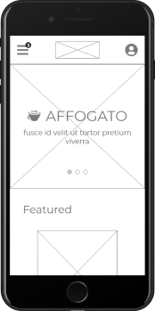
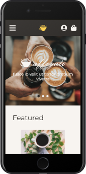
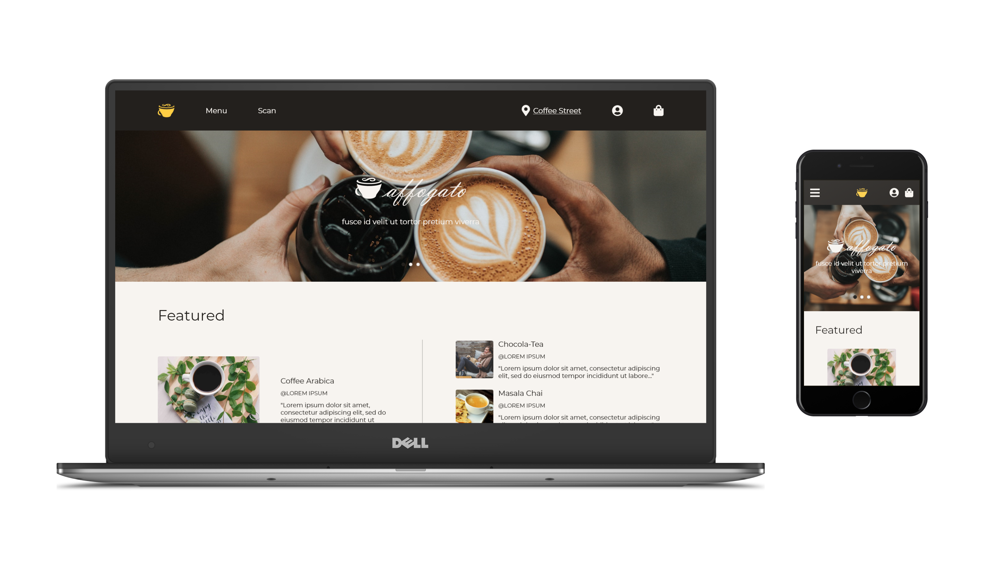
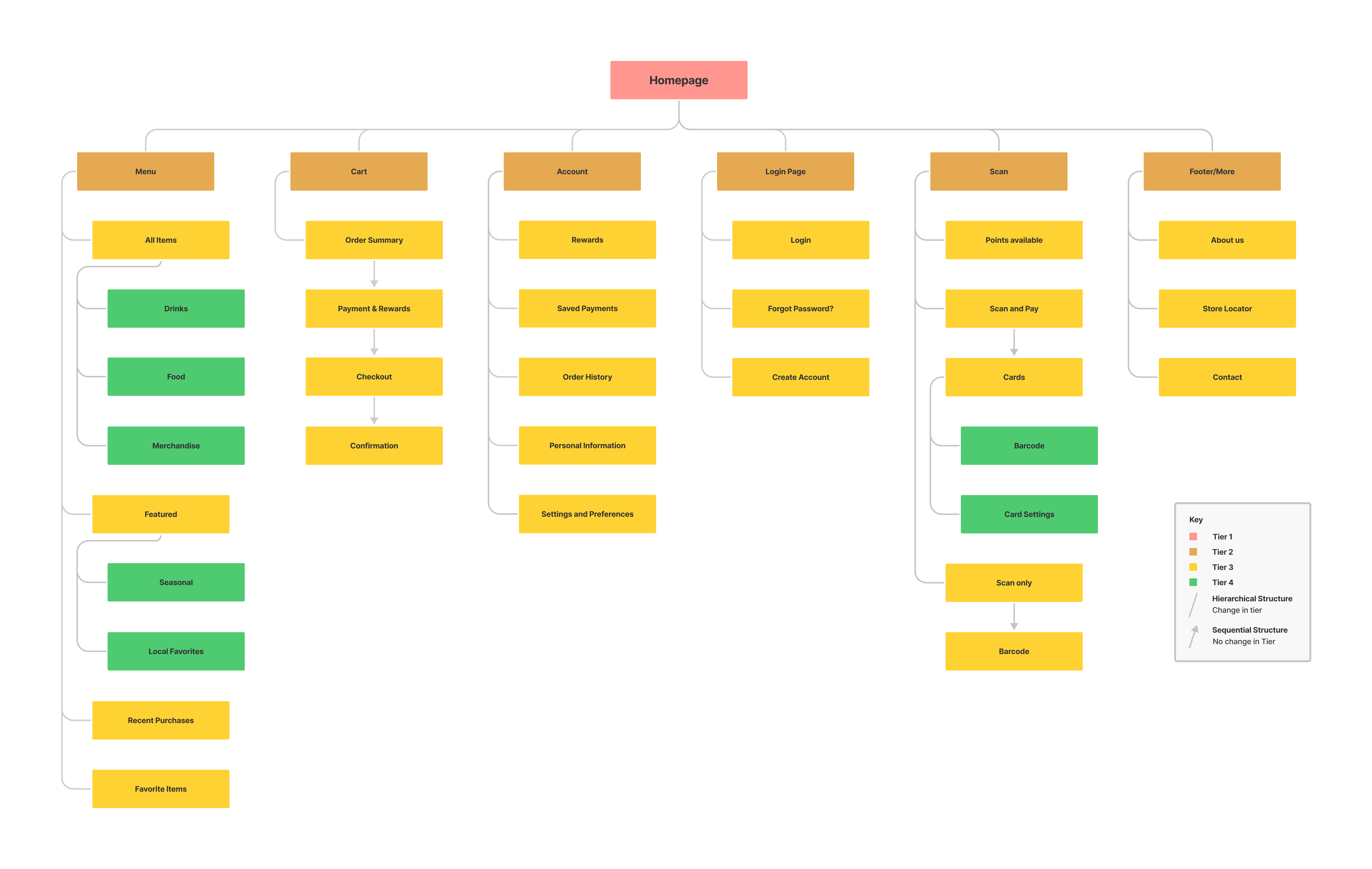
The user flow I focused on was ordering a drink - a hot tea, specifically.  When I first made the “Menu” wireframes, I had a grid of outlined cards contained within in their own scrollable section.  However, with the lack of color and different states of the elements like the buttons and cards, users could figure out which elements should be clickable in a finished product, but not what elements were currently active.  When I transitioned to mockups, I used color to indicate a hover state on interactive elements, like the specific drink users could order.  I also used the gold accent color to define the important “call-to-action” elements, like buttons, and created a disabled state for elements that weren’t currently active.  I removed the inner scrollable section, since that was confusing users, and I also got rid of the outlines, since with the new background color they made the site look like a static HTML webpage.
Wireframe of Hot Teas Menu page
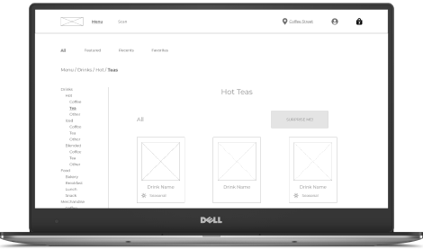
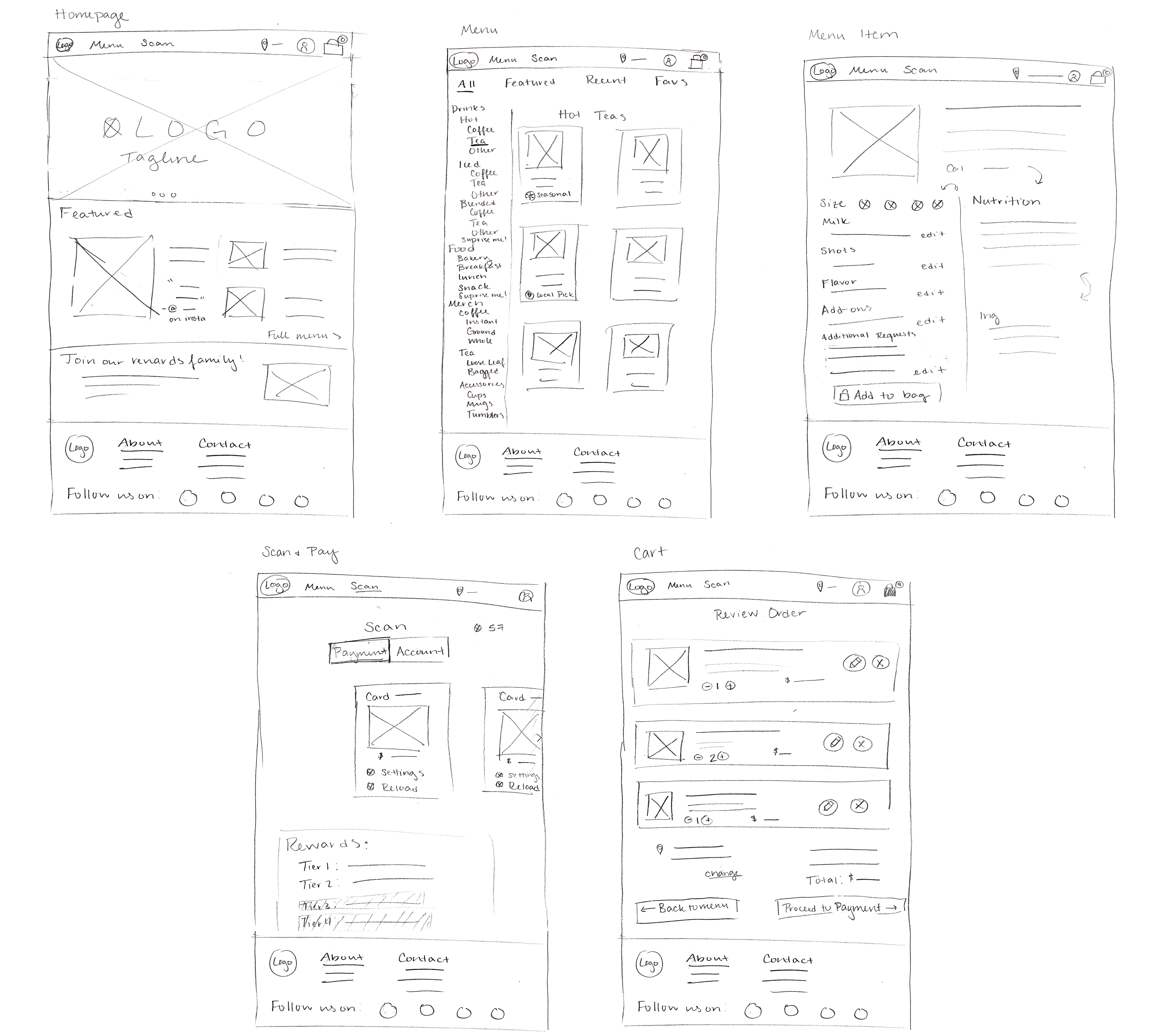
Wireframe of the “Hot Teas” section of the “Menu” page.  The whole page scrolls down to reveal the footer, and the “Hot Teas” section scrolls to reveal more teas.
Mockup of Hot Teas Menu page
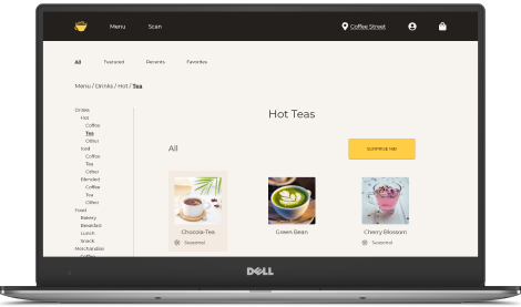
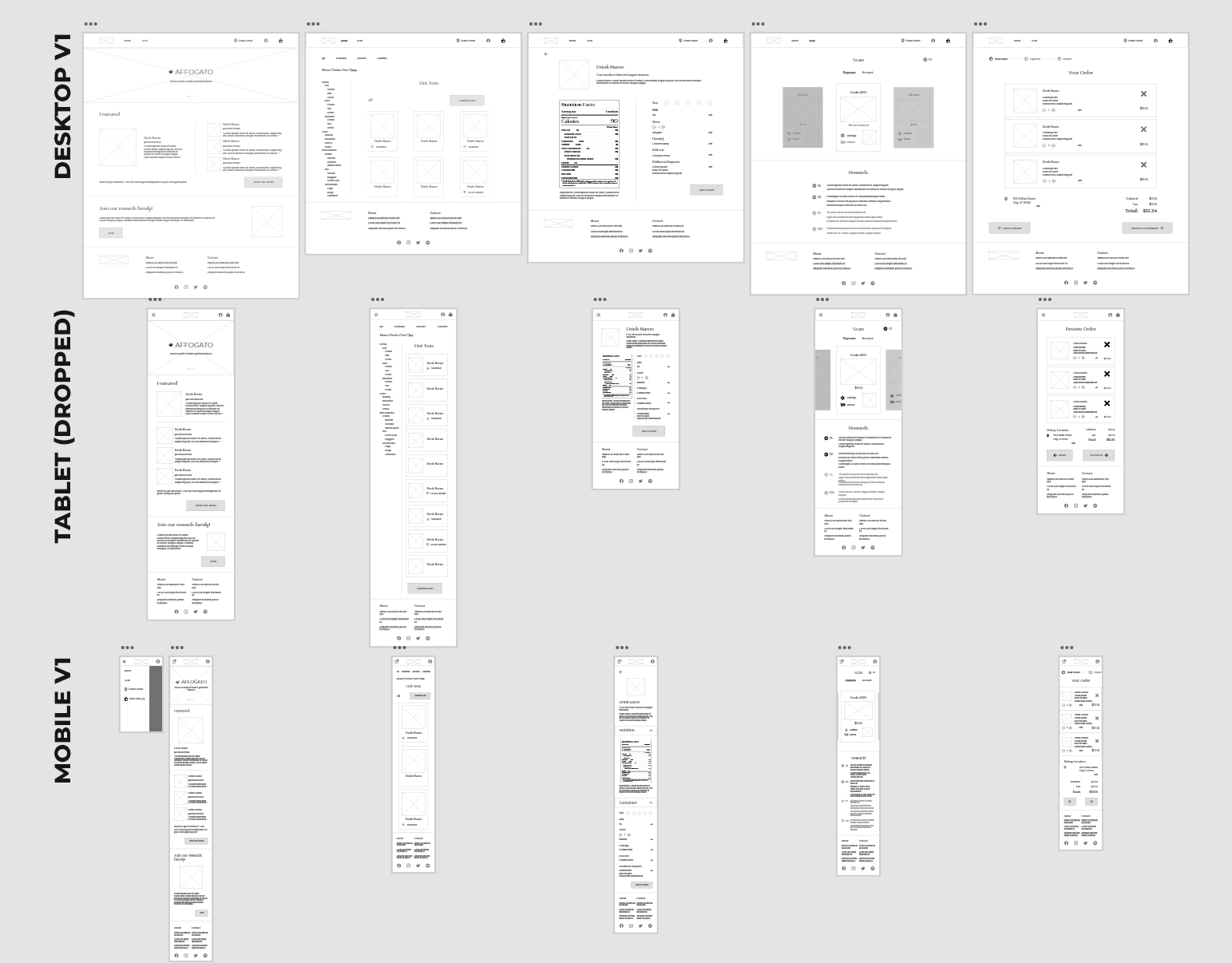
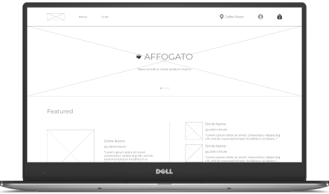
Mockup of the “Hot Teas” section.  The only selectable tea, the “Chocola-Tea,” changes background color on hover on the desktop version (shown above).
When it came to checking out, I only created one wireframe for the payment page with a blank form for data entry.  Since any filled entry pages would have been practically identical to the blank one and didn’t really need designing, I thought I wouldn’t need to include them since users know what to do there.  However, during testing, users kept getting frustrated when they couldn’t input the information into the form, so I added additional mockup pages with filled in entries of how the user wanted to pay for their order.
Mockup of the Chocola-Tea customization page
Initial wireframe of the payment page, with a blank form and a set card selection.
Mockup of Payment page
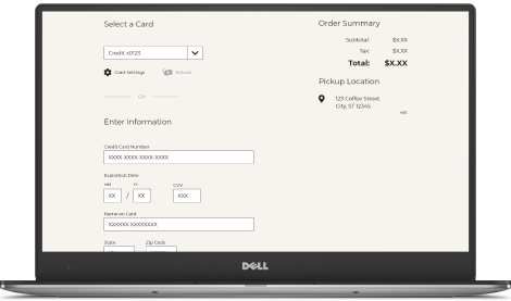
Mockup of the payment page.  The form fills itself when any field is selected, and the dropdown menu to select a card works and has two options.
In the end, users did think the ordering and process was fairly intuitive, even with these pain points present.  Another test on the mockups should be done to determine if the new changes help or hinder that belief.
"It was pretty easy to use after only seeing it once."
- Quote from a study participant

Challenge 3: Make any hidden or confusing information easily visible to the user.

In my initial interviews, I got a hodgepodge of different complaints about a lack of information - hidden price tags, unknown (and often long) wait times, no easy way to get directions, and so on.  I knew I couldn’t and shouldn't address every single complaint I got, and since none seemed to be repeated amongst interviewees, I just had to select the few I deemed most important to the ordering process.  I made sure the price of the item was shown when a user selects its customization page, and on the order confirmation page, I gave the user an estimated wait time and a clear button to get directions to their selected location.  Moving forward, I might have made the wait time more obvious from the start by providing a live crowd chart on the homepage.
Mockup of the Chocola-Tea customization page
Menu item page, with the price visible alongside the item name
Mockup of order confirmation page
Order confirmation page, with a time stamp for when the order was placed and an estimated completion time.  The “Get Directions” button is below the fold in the order summary.

High-fidelity prototype

Check out the live prototype for both platforms!

Takeaways

Impact
The Affogato website shows just how effective responsive websites can be for small businesses.  When prejudices against mobile websites can be eased in businesses with a mobile-dominant user base, small startups don’t have to use up valuable resources developing apps for different platforms.
What I learned
I learned that I need to go back and study the user profiles and past research during every step of a project, particularly ones in which there’s a large gap between the start and finish.  I ended up taking a month-or-so-long break from this project during the paper wireframe phase, and when I came back to it, I based my project solely on those designs rather than re-reading my past research.  While I did tackle the client’s main concern of responsiveness, I failed to look at the big picture and adequately address the user’s biggest pain point...

4

Poor communication
Whether it’s poorly worded specials, a lack of contact info and directions, or a failure to indicate an item being out of stock, most customers had something to say about their communication with the café.
While I could (and at some stages did) go back and add those features to the existing designs, if I were to do this project again, I would start with the communication of the business as my main priority and would let the responsiveness fall into place later.
Case Study Slide Deck
Back to top
Internet Explorer logo

Your browser is out of date!

It seems like you're currently using IE. Unfortunately, IE doesn't work with my website or any of my linked sites. I highly recommend you update your browser using one of the links below.
Chrome logo
Chrome
Firefox logo
Firefox
Safari logo
Safari
Edge logo
Edge