Project background

Éire Estates is a fictitious wedding venue located in Cork, Ireland that I created for my Google UX Design Certificate Program project.  I was tasked with building a virtual tour app to generate more interest in the venue from both busy working couples and destination wedding shoppers.  While the virtual tour is the star of the show, the app also addresses many other common user pain points related to the booking and shopping process. My main goal with this project was to make the navigation as simple, intuitive, and invisible as possible so that the venue’s content could really shine.

Challenges

1
Create a virtual tour experience that is easy to use and fun to navigate.
2
Ensure all basic information is clear and available to all users.
3
Design a responsive, familiar messaging system to encourage communication with the venue.

Initial research

To start off the project, I sat down and brainstormed who I thought my user base would be and what questions I could ask to learn about the search process.  At this stage, the questions I centered my research on were:
I then conducted interviews with the target audience and created empathy maps based off of my findings to get a better understanding of the user base.  The research confirmed my assumptions that time, money, and poor imagery were some of the biggest issues while venue shopping, but they weren’t the only ones; poor communication and a lack of availability were big concerns as well.  I had also assumed that users may use the virtual tour in place of an in-person tour, but nearly all of the interviewees wanted to tour in-person as well.  To the user base, virtual tours are a useful way to narrow down their list of venues, but they wouldn’t be used to make a final decision. I also completed a competitive audit report at this stage to see how similar venues chose to lay out their websites. I quickly discovered exactly why users had these issues; image galleries and virtual tours were often spread out across multiple websites, and I had a hard time finding enough basic information to cover the contents of my report, much less to make a major decision, without contacting the venues.

Pain points

1

Lack of high-quality images
Many venues have poor-quality images or a lack of images of the venue, making it difficult for couples to visualize the venue without visiting.

2

Hidden prices and availability
Prices and availability were either not available or extremely hard to find without contacting the venue first.

3

Slow or poor communication
Couples had a hard time getting venues to get back to them in a timely manner.

Meet the users

Haoyang's Persona File
Haoyang: the destination, scenery-oriented shopper
Aisling's Persona File
Aisling: the local, family-oriented shopper

Creating a user flow

When I first designed the user flow diagrams, I knew I needed 4 pages: a homepage, an information page, a virtual tour page, and a messaging page.  I created the first diagram as a way to organize how I wanted these pages laid out, but as I started coming up with wireframes I realized that I needed to change some areas, particularly those requiring a confirmation, in order to retain a more natural and fluid user flow with minimal interruptions. The second diagram reflects the final updated user flow.
Original user flow diagram
First user flow diagram, with confirmation messages and a need to go back to the homepage to get to the others.
Updated user flow diagram
Final user flow diagram, with the user profile page and easier navigation between the main pages.

Let’s get wired up!

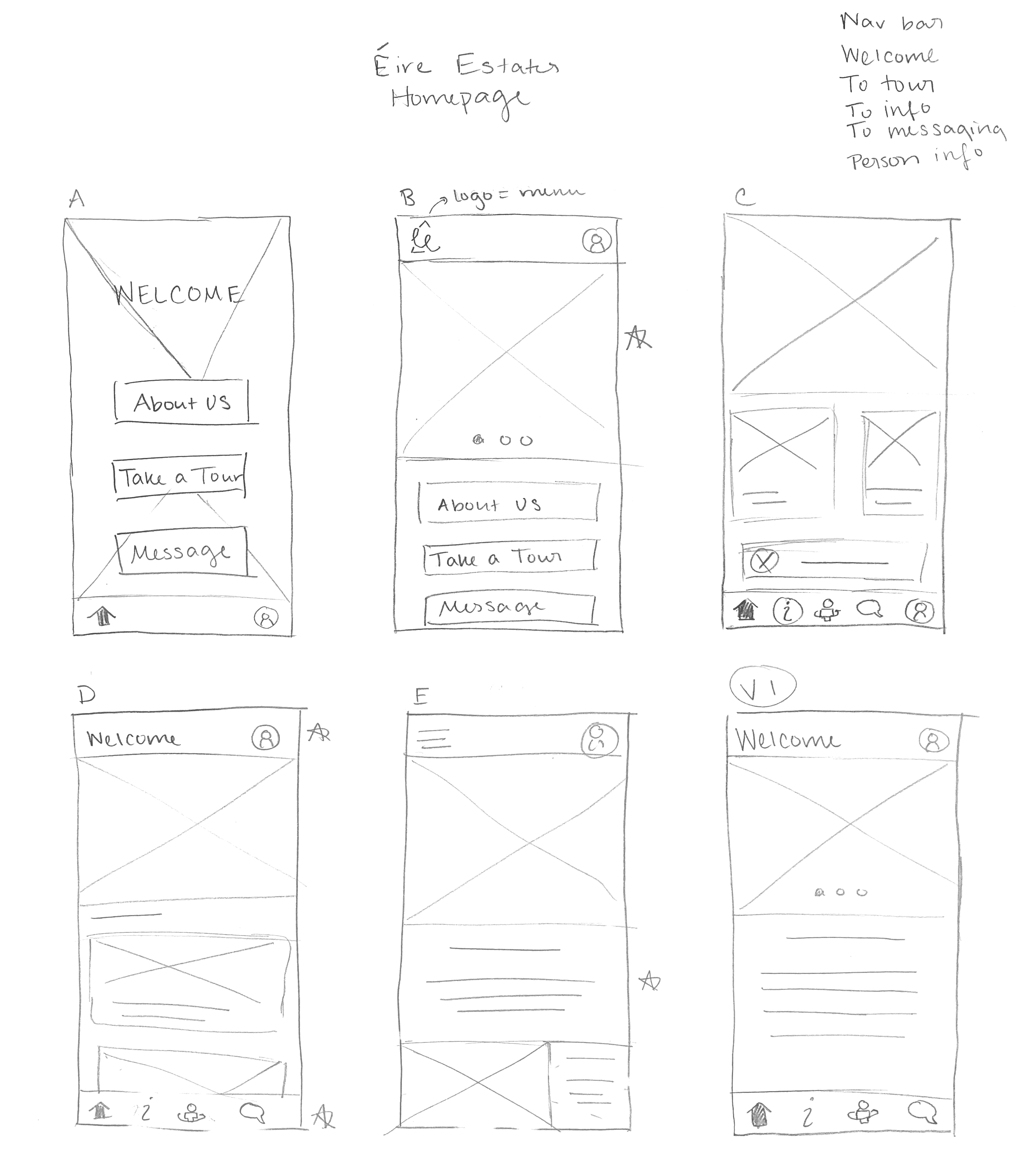
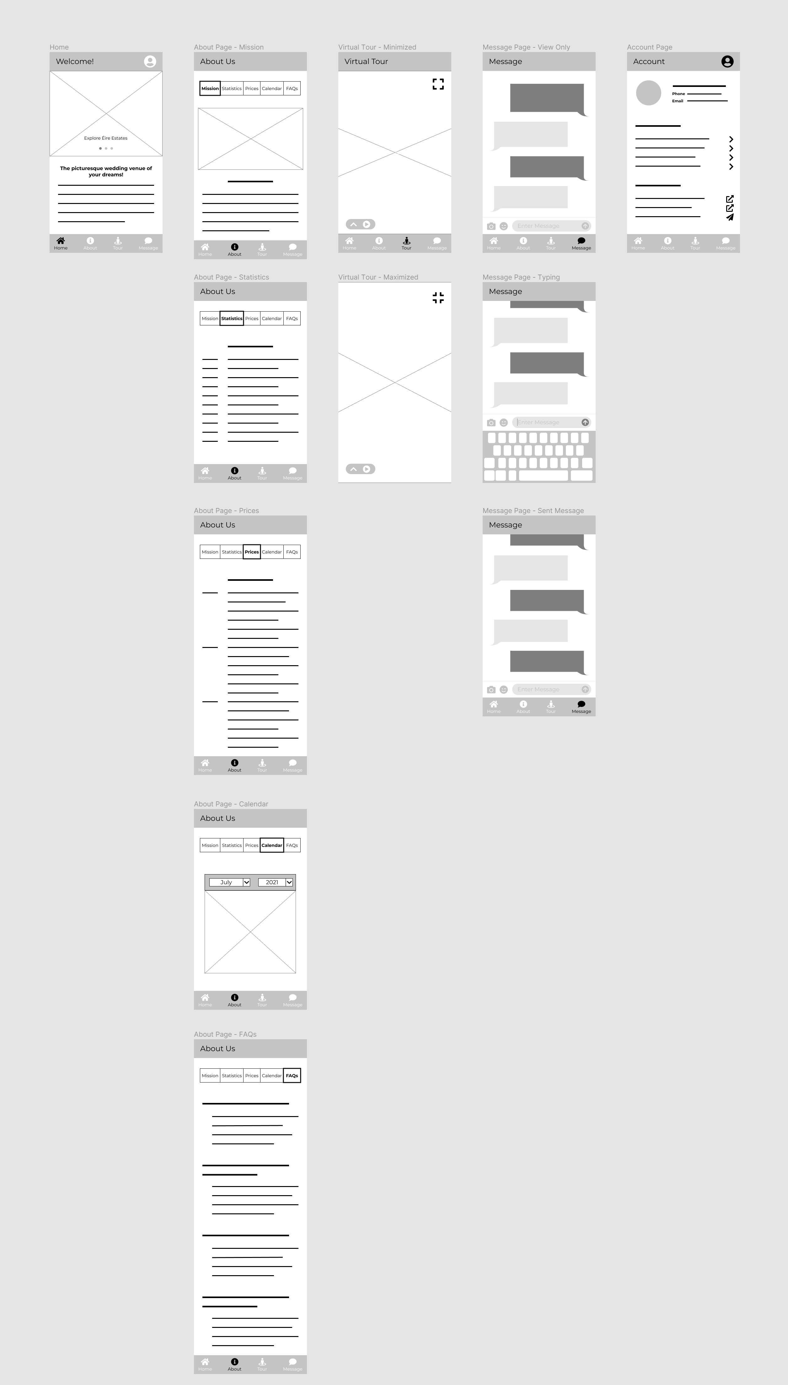
Making paper wireframes helped me explore many different ideas for each screen quickly so I could find what components would work best for the user base.  For the home screen, I focused on making the screen feel simple and natural, both in design and navigation. I listed all the necessary components in the upper right corner, then designed five different versions of the home screen.  After starring the components I liked from those designs, I created the first working version of the home screen.
Paper wireframing process for the homepage
Digital wireframes for the full app

Going digital

When moving to digital wireframes, I was able to clean up the paper wireframe design and ensure the content that users wanted based on the interviews was all present.  While the virtual tour is the primary focus of the app, it was difficult to fully envision it at this stage without any imagery.  I focused on getting the navigation in place to make the transition to mockups easier.

Low-fidelity prototype

Using my digital wireframes, I created a low-fidelity prototype in Figma.  Since my app was designed for browsing rather than a singular user flow, I connected all of it, so users could get anywhere they wanted to go.
Check out the prototype on Figma!

User testing

I conducted two rounds of moderated usability testing: one after creating the low-fidelity prototype and one after creating the high-fidelity prototype.  While testing, I found that while users do appreciate easy navigation, it’s the content and details about the venue that interest them the most.
Round 1 findings
1
Users need an easily accessible contact page.
2
Users need clearer, more commonplace terms.
3
Users value a venue that meets their specific needs above all else.
Round 2 findings
1
Users need real, English text to fully understand the app’s capabilities.
2
Users need some sort of guidance on how to use the virtual tour.
3
Users want their profile information to be accessible from all pages.

Challenge 1: Create a virtual tour experience that is easy to use and fun to navigate.

Wireframe of the Tour page
Wireframe of virtual tour page
Final mockup of the Tour page
Final mockup of virtual tour page
Getting feedback on the tour for the first round of usability testing proved more challenging than anticipated, since the users were having trouble picturing the tour without, well, pictures.  I relied heavily on the second usability study to work out the kinks in the tour.  That study revealed a lot of confusion surrounding the tour’s navigation; users didn’t recognize immediately that the tour was movable or that the tooltips were tappable, and some users spent the whole session with the tour’s navigation menu up, meaning they were only viewing about half of the screen.  To clarify the process, I added an info screen that explains all navigation movements and icons and minimized the navigation menu on arrival.
Third mockup of the Tour page
The original screen seen upon selecting the tour
Tour tutorial popup for the Tour page's final mockup
The new information screen seen upon selecting the tour

Challenge 2: Ensure all basic information is clear and available to all users.

After my initial research, I knew I needed to show both the venue’s prices and availablity in the “About” page.  The first usability study revealed some confusion surrounding the terms “Mission” and “Statistics,” and many users wanted the venue’s contact information in addition to the messaging system.  I ended up removing the “Mission” section altogether, as it was incredibly similar to the welcome paragraph/venue summary on the home page.  I also changed the confusing label “Statistics” to “Details” and added a “Contact” page with the venue’s address and contact information.
Original wireframe of the venue's "Mission" page
Original wireframe of the information page, containing the price and availability viewing that users wanted.
Updated wireframe of the venue's About page
Updated wireframe after usability testing, including the new “Contact” tab and the updated “Details” tab.
Final mockup of the venue's About page
Final mockup of the information page.  The only change is that the user profile icon has been added across all pages, making profile access easier.
During the second usability study, many participants had issues finding the venue’s phone number and email address becaues they did not realize that they could scroll the page beyond the map.  To fix this, I put the contact information before the map so users could see the most important information immediately.
First mockup of Contact page
First mockup of the contact page, in which users were having issues finding the venue’s phone number.
Final mockup of Contact page
Final mockup of the contact page, with the map below the contact info.

Challenge 3: Design a responsive, familiar messaging system to encourage communication with the venue.

When I first came up with the idea to use a messaging system in the app, I had intended to format it like an email system.  However, after reviewing my initial interviewees’ complaints about long email response times, I decided to make it a text messaging system instead to steer clear of those negative associations.  The app’s messaging system creates positive associations with the more instantaneous nature of texting and enhances the user’s familiarity with the mobile interface.  After that initial change, though, the messaging system largely stayed the same throughout the design process because most users were thrilled by it as it is.
Original wireframe of messaging system
Original wireframe of the messaging system.
First mockup of messaging system
First mockup of the messaging system, with the original, slightly darker color palette.
Final mockup of messaging system
Final mockup of the messaging system, with the altered color palette that meets accessibility standards.

High-fidelity prototype

I connected all of my mockups to make a high-fidelity prototype, which has so many connections and animations that I couldn’t show them all in one short video.  I highly recommend playing around with it in Figma.

Takeaways

Impact
The accessible information and ease of use of the Éire Estates app make users feel more confident in their understanding of the venue and more comfortable contacting the venue for any questions, concerns, or enquiries.  However, in the end, it is the user’s personal preferences, budget, and resources that determine whether or not a user chooses to use Éire Estates as a venue, not the app itself.
What I learned
During the design process, I learned that iteration is the key to success.  Focusing on solidifying the design right from the start helps very little in the long run, as user feedback influences and changes the designs far more than you would expect.  The more feedback and iterations you do, the better the product is.
“After using the app, I would very much want to message the location… It's so easy to use that I wouldn't feel bad about [it].”
- Quote from a study participant
Case Study Slide Deck
Back to top
Internet Explorer logo

Your browser is out of date!

It seems like you're currently using IE. Unfortunately, IE doesn't work with my website or any of my linked sites. I highly recommend you update your browser using one of the links below.
Chrome logo
Chrome
Firefox logo
Firefox
Safari logo
Safari
Edge logo
Edge